
In the current digital era, where graphic design is crucial to drawing in and holding the attention of an audience, producing visually appealing material is a critical ability. Ten crucial graphic design pointers to improve your visual content are listed below:
Table of Contents

Recognize the Design Principles:
Any excellent design is built on the fundamental design concepts of movement, proportion, emphasis, balance, contrast, and rhythm. While contrast highlights contrasts between pieces to make them stand out, balance entails arranging them evenly to provide stability. By comprehending and putting these ideas into practice, you can make sure that your designs are both visually beautiful and communicate effectively.
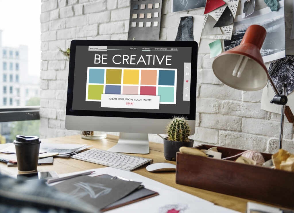
Employ a Harmonious Color Scheme:
Design decisions on color are critical because it sets the tone, elicits feelings, and communicates brand identity. Choose a color scheme that complements the tone and meaning of your writing. To develop harmonious color schemes, use programs like Adobe Color. To keep consistency and prevent the viewer from becoming overwhelmed, restrict the number of colors you use.
Give typography priority:
Typography is about building a visual hierarchy that leads the reader through your material, not merely choosing a typeface. Select typefaces that work well with your design and are readable on a variety of screens. Vary the font styles (such as serif and sans-serif) to create contrast, but keep the quantity of fonts to a minimum to keep the design tidy and businesslike.
Make Use of White Space:
The void space surrounding design features is known as white space, or negative space. It’s essential for avoiding clutter and producing a composition that is balanced. White space enhances readability and helps focus the viewer’s attention on important parts. Don’t be scared to use lots of white space to allow your design to breathe.
Make sure the hierarchy is visual:
The term “visual hierarchy” describes the arrangement of things according to significance. Utilize alignment, contrast, size, and color to provide the viewer’s eye a clear path. Subheadings and body text should be the next most noticeable parts after headlines. This facilitates the audience’s navigation of your content.

Aim for Readability:
Readability is crucial, particularly for designs with a lot of text. Make sure the font sizes and line spacing in your writing are legible. Clear fonts and a strong contrast between the text and background will make your message easy to read. Avert lengthy paragraphs and divide the content into more digestible sections.
Employ Images of the Highest Quality:
Images can greatly improve your design, but only if they are pertinent and of good quality. Photographs that are grainy or pixelated can take away from your professionalism. Make use of high-quality photos and make sure they are either free to use or have the appropriate license. A range of excellent photos can be found using resources like Unsplash and Pexels.
Maintain Consistency:
Maintaining a consistent style throughout all content guarantees a unified appearance and enhances brand identification. To ensure uniformity in layout, fonts, and color schemes, use a style guide. Whether it’s through printed materials, web design, or social media graphics, your audience should be able to identify your brand right away.
Include Easy-to-Understand Icons:
Icons can enhance the visual appeal of your material and aid in the rapid communication of ideas. Select uncomplicated, lucid icons that complement your design aesthetic and amplify your message without overpowering the layout. Make sure their size, style, and color are all the same throughout your article.
Get Input and Continue Iterating:
The process of design is iterative. Ask for input from stakeholders, colleagues, or even your intended audience. New insights can highlight areas that you may have missed that need work. Stay receptive to feedback and prepared to make changes as needed to improve your design.
Utilizing These Suggestions
Recognizing Design Principles
Consider making a flier for the introduction of a new product. By using the emphasis principle, you may enlarge the product image and highlight it with striking colors to make it stand out as the main focus.
Employing a Harmonious Color Scheme
Using a cool color scheme consisting of grays and blues might help a tech company’s website design communicate professionalism and dependability. The site’s design will come together if these colors’ tints and tones are used consistently throughout.
Giving Typography First Priority
A blog post’s headline should be written in a bold, sans-serif font to draw readers in, while the body text should be written in a serif font to improve readability. Readers may quickly navigate through different parts with the help of a proper hierarchy and varying font sizes.
Making Use of White Space
Enough white space surrounding text and photographs in a brochure helps to break up the arrangement so that readers may concentrate on certain aspects without getting overwhelmed.
Making Certain Visual Hierarchy
A landing page may be efficiently navigated by displaying a huge, attention-grabbing headline at the top, followed by smaller subheadings and succinct text that highlights important elements.

Enhancing for Easy Reading
Using text that is clear and wide with a strong contrast against the background in a social media post guarantees that the content can be easily seen, especially on small displays.
Using Superior Pictures
High-quality photos of products taken from various perspectives can improve the online buying experience and give the site a trustworthy, business-like appearance.
Maintaining Consistency
Brand identification is strengthened and the campaign is made more memorable when the same fonts, colors, and layout are used in all materials—flyers, emails, and social media posts.
Including Uncomplicated and Visible Icons
Simple icons for home, settings, and profile on an app’s UI make it easier for users to navigate and comprehend, which enhances usability.
Requesting Input and Repeating
After creating a logo, getting input from various stakeholders might yield insightful information. Reworking the logo in light of the input will guarantee that it speaks to the target market and accurately conveys the brand.
Graphic Design:
By putting these 10 crucial graphic design pointers into practice, you can greatly improve your visual material and make sure it engages your audience and effectively conveys your message. Brilliko Institute of Multimedia also known as the pinnacle of graphic design era.


